Brief
For their 10 years TheFork want to harmonize their online presence beginning with the corporate website wich present the many facets of theirs services.
How to speak to different targets within an unique website which is modern and accessible
They made it
Lot of people have been working on this project, here is our part of people working on it.
-
 Josué Pichot
 -
 Gwendoline Gendron
 -
 Michael Noiville
 -
 Kevin Ronceray
Idea
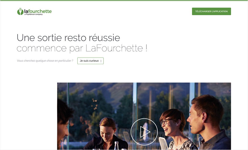
TheFork used to have plenty of standalone websites with different objectives. This new website has to present the many services of TheFork to different Targets (clients, journalists, professionals, candidates)
So we proposed a modular website which let reorganize content and messages depending of the type of user.

Design
This website is intented to lay the first brick of the new identiy of TheFork. So we have thought a design which transcribe the service quality. This results in a layout with spaces counterbalanced with large pictures and an emphasis on typography.
We have also produced the writing of the content, offering a tone of voice specific to TheFork, which brings sympathy and proximity with the brands.
Code
The difficulty was to propose a solution which is handy for 13 people in charge of the traduction of the content for the different country in which the website is available.
We have chosen WordPress as a CMS with the multisite feature. Indeed, its flexibility let us create entirely customizable page in terms of layout as well as translation of content.


