Brief
Orchid Creation specialise in enriching and redesigning PowerPoint and Keynote presentations.
From what often starts out looking unappealing, the agency redesigns the whole process and brings each transition and slide to life – guaranteed to impress!
How can we show in two clicks the added value of their work?
Parfois, internet c'est quand même de l'art. orchidcreation.com by @fcinqagency @bmainier Social Content Manager
They made it
Lot of people have been working on this project, here is our part of people working on it.
-
 Jérémy Petrequin
 -
 Priscillien Gac
Idea / Design
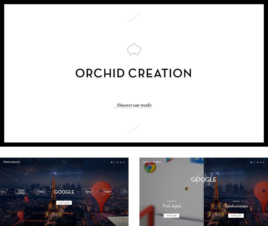
We put the concept of before/after at the heart of the design and chose a split screen to represent this.
Using diagonal transitions, users were able to travel through time and browse between projects, looking at the original and remastered version.

Code
In web development, diagonals are not necessarily your friends. Most transitions use these diagonals which cover or reveal interface elements.
We had to manage these effects in other ways according to their rendering: css, svg, canvas, everything.
In the end, we managed to have smooth, polished and clean transitions whether it was small text or full screen visuals.


